


Table of contents


No headings in the article.
INTRODUCTION
An online store owner has sales representatives in 4 regions- North, Central, Caribbean, and South. He sells items that fall under three categories - Office supplies, Technology, and Furniture. This analysis is prepared to help him decide which region to build his first physical store and what items to sell.
ANALYSIS TOOL
I performed data cleaning, visualization, and dashboard creation using Microsoft Excel. I used Excel because the data has only 49 records.
DATA CLEANING
I cleaned the data by checking for duplicates and missing values, of which I found none.
I formatted the profit, shipping, and sales columns into the correct data types.
I made sure that the data was free of errors.
DATA ANALYSIS
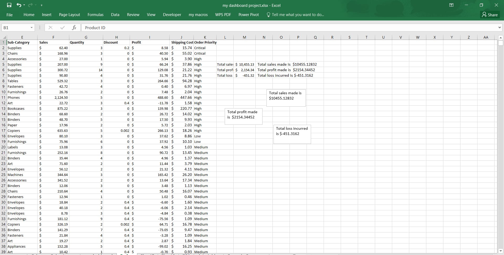
- I used the sum function to calculate the total sales made.
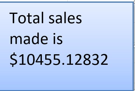
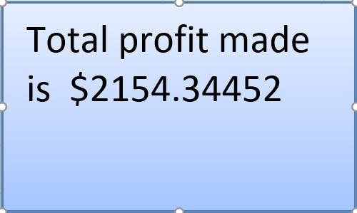
- I used the SUMIF function to calculate the total profit and loss incurred.
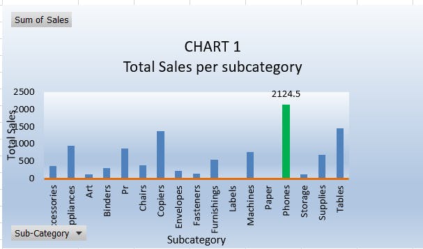
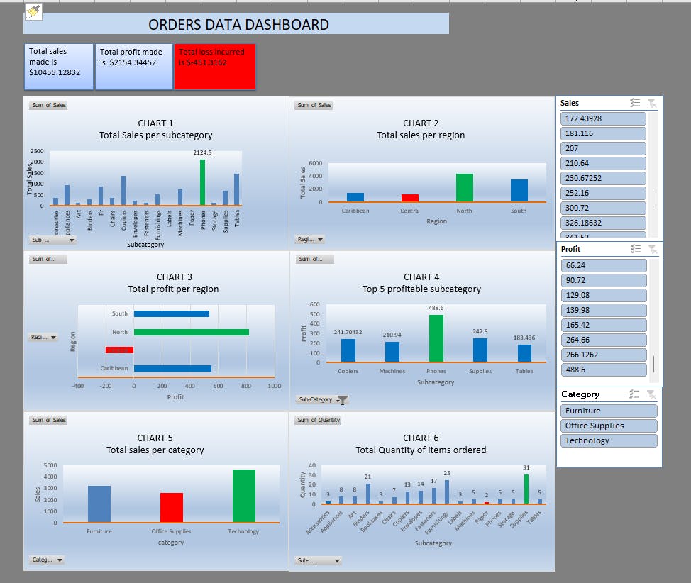
- Chart 1 shows that phones have the highest total sale of $2124.5 while labels have the least total sale of $13.08.
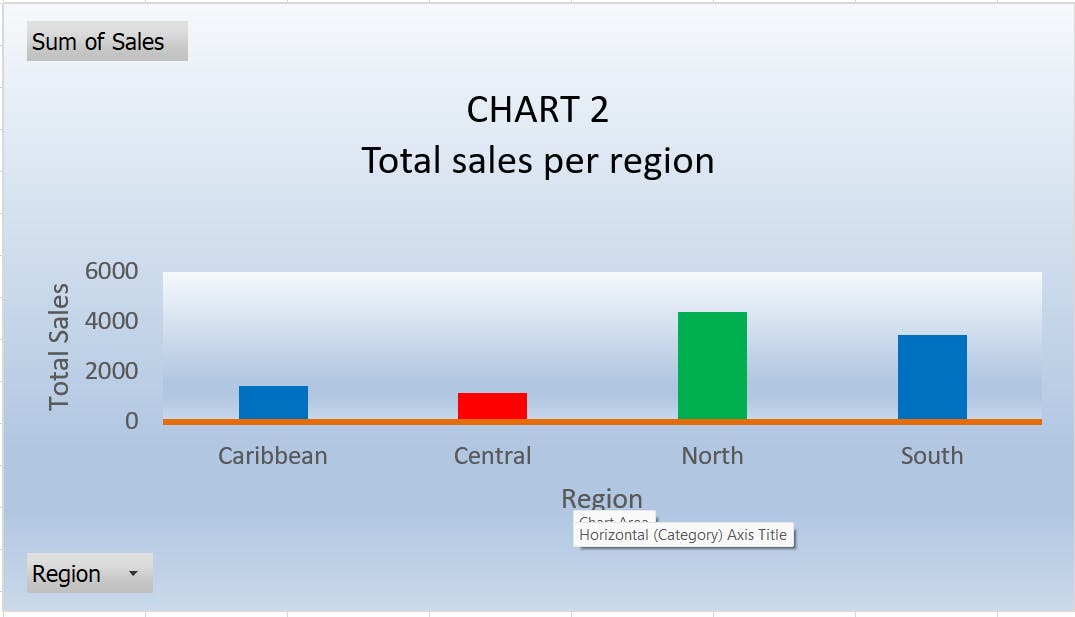
- Chart 2 shows that the most sales were made in the Northern region while the least sales were made in the central region.
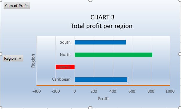
- Chart 3 shows the profit made in each region. The highest profit of $816.64 was made in the Northern region, but in the central region, a loss of $199.38 was incurred.
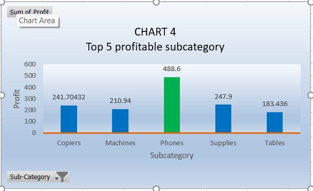
- Chart 4 shows the top 5 subcategories from which profit was made. The most profit was made from the sale of phones, supplies, copiers, machines, and tables, in this order.
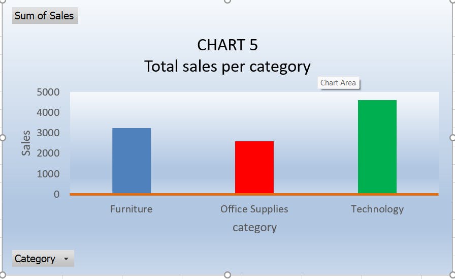
- Chart 5 shows the total amount of sales made in the 3 product categories. Most sales were made in the technology category and the least sales were made in the office supplies category.
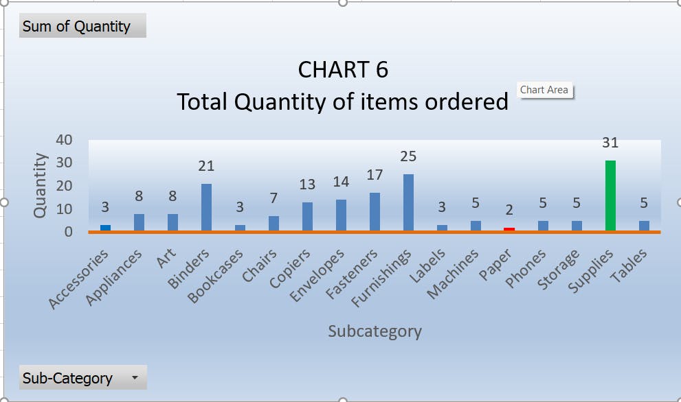
- Chart 6 shows the total quantity of each item ordered. Customers made the most order quantity of 31 for supplies and the least order quantity of 2 for paper.
DASHBOARD
I moved the already prepared charts to the new worksheet.
I added 3 slicers to the dashboard, and made a connection among them to make filtering easier.
A combination of all the relevant visuals for this study is shown below:
INSIGHTS
There is high demand for copiers which are the most ordered in the Technology category.
The highest sales and profit was made in the North.
Selling only 5 units of phones produced the most profit.
A one-time loss was made in the North and South. Discounts were given for these sales.
RECOMMENDATIONS
More attention should be put in the North and the sales of items in the Technology category.
Promotion of the phones through advertisement or promos should be considered.
The store owner should focus more on the 5 most ordered items.
In the Central region, most items were sold at discounted prices. This made the store run at a loss. The percentage discount given should be reduced or scrapped entirely since the store cannot afford giving discounts.